


What makes our CV different to our LinkedIn profile?
July 13, 2025
Where postgrad statements get personal
September 12, 2025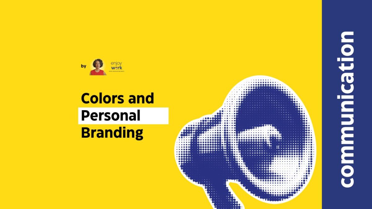
Imagine a world without colours. How would you feel if suddenly everything turned black and white? Colour creates powerful feelings. It lightens us up, it makes us think, it aids relaxation, boldness or optimism.There is a whole branch of Psychology, called “colour psychology” that looks into how colours affect our lives.
Our personal brands could be no exception: the right colour enables emotional bonding with our personal brand. Colour is a subliminal method of communicating our personal brand attributes.
Given that we are very clear on which our attributes really are we can select the colours that convey the message we need. Our choice of colours has got a number of applications: websites, marketing materinal, business cards, business attire, signs.
Please remember that whereas it is not compulsory to choose just one colour for our website, for example, we need to make sure that it nevertheless conveys a lasting and clear impression. Also please note that all colour meanings referrred to here, relate to the Western Civilization and traditions.
BLUE
Dark shades of blue denote credibility, authority, trust, integrity, loyalty. It is often used by corporate brands especially in the Financial sector, IT companies, conservative political parties and medical institutions.
Website and logo examples: Police, IBM, Nokia, Deloitte, KPMG, facebook
The lighter shade is usually associated with the water, the sea, the journeys…
Examples: VIKOS mineral water, Zagori mineral water, Blue Star Ferries
RED
The colour of excitement (and tension), enthusiasm, risk (and danger) it signifies brands that denote passion, high energy, decisiveness. When we look at red our hearts beat faster.
Think of Virgin, Coca Cola, Vodafone, The Fire Service.
The lighter shade of red (pink) is connected to female energy rather than the male one linked to darker red shades.
Look carefully at Evian”s website where pink is combined with light blue
GREEN
The Body Shop, Starbucks, Cosmote: there websites and corporate identity are in the shades of green which is linked to freshness, natural, environmentally friendly, vitality, newness.
In its darker shade the colour green is associated in the Western civilization with money, whereas in the Chinese Philosophy red is the colour of wealth.
YELLOW
The colour of the sun, is deeply associated with sun-like qualities: light, warmth, positive energy, optimism. The lighter yellow is the colour our eyes can see first of any other colour, it is therefore often used to attract attention. Yellow also helps us make decisions, which is also beneficial when leading to purchases.
Think of SHELL, KODAK, Ferrari, Lamborghini, JCB and IKEA which combine yellow with red for energy and passion and blue for reliability.
Next Sunday we will look at the remaining basic colours and how they affect our personal brand.
Until next week, take good care of your career.

